TONT 38233 时常被误解的 /3GB 选项

原文链接:https://devblogs.microsoft.com/oldnewthing/20040805-00/?p=38233

It’s simple to explain what it does, but people often misunderstand.

解释这个选项“是什么”很容易,但人们又误解它的含义。

The /3GB switch changes the way the 4GB virtual address space is split up. Instead of splitting it as 2GB of user mode virtual address space and 2GB of kernel mode virtual address space, the split is 3GB of user mode virtual address space and 1GB of kernel mode virtual address space.

/3GB 选项使得 4GB 虚拟地址空间的划分方式发生了变化。原来是划分为 2GB 的用户模式虚拟地址空间和 2GB 的内核模式虚拟地址空间,启用后则变成了 3GB 用户模式虚拟地址空间和 1GB 内核模式虚拟地址空间。

That’s all.

仅此而已。

And yet people think it does more than that.

然而人们却仍然想太多。

I think the problem is that people think that “virtual address space” means something other than just “virtual address space”.

我认为,问题可能出在人们认为『虚拟地址空间』这个说法有其字面含义之外的东西。

The term “address space” refers to how a numerical value (known as an “address”) is interpreted when it is used to access some type of resource. There is a physical address space; each address in the physical address space refers to a byte in a memory chip somewhere. (Note for pedants: Yes, it’s actually spread out over several memory chips, but that’s not important here.) There is an I/O address space; each address in the I/O address space allows the CPU to communicate with a hardware device.

术语『地址空间』指的是当存取某种类型的资源时,一个数字值(即所谓『地址』)是如何被对应解释的。一种地址空间被称作物理地址空间,每个物理地址空间中的『地址』都指向在内存芯片中的某个字节。(致读死书者:没错,这个地址的确是囊括了多块内存芯片的范围,不过在这里这不是重点。)还有一种叫I/O地址空间,其中的地址使得CPU得以与某个硬件设备进行通讯。

And then there is the virtual address space. When people say “address space”, they usually mean “virtual address space”.

再来就是虚拟地址空间了。当人们提及『地址空间』时,通常指的就是『虚拟地址空间』。

The virtual address space is the set of possible pointer values (addresses) that can be used at a single moment by the processor. In other words, if you have an address like 0x12345678, the virtual address space determines what you get if you try to access that memory. The contents of the virtual address space changes over time, for example, as you allocate and free memory. It also varies based on context: each process has its own virtual address space.

虚拟地址空间是在某一时刻处理器可以使用的一组可能的指针值(地址)。换句话说,如果你有一个类似0x12345678这样的地址,那么如果试图访问这个地址的内存的话,是由虚拟地址空间来决定你获取到的内容的。虚拟地址空间的内容随时间不断变化,例如,每当分配和释放内存时(都会发生变化)。依据场景不同,虚拟地址空间的所指也会发生变化,每个进程都有其自己的虚拟地址空间。

Saying that 2GB (or 3GB) of virtual address space is available to user mode means that at any given moment in time, out of the 4 billion virtual addresses available in a 32-bit value, 2 billion (or 3 billion) of them are potentially usable by user-mode code.

有2GB(或3GB)虚拟地址空间对用户模式可用这个说法,意味着在任何给定的时刻,在32位值、共40亿的虚拟地址中,有20亿(或30亿)的地址对用户模式的代码是潜在可用的。

Over the next few entries, I’ll talk about the various consequences and misinterpretations of the /3GB switch.

在接下来的几篇文章中,我将讨论有关人们对/3GB选项的不同拓展解释,以及由此引发的误解。

TONT 38303 为什么应该使用凹陷的用户区域?

原文链接:https://devblogs.microsoft.com/oldnewthing/20040729-00/?p=38303

The WS_EX_CLIENTEDGE extended window style allows you to create a window whose client area is “sunken”. When should you use this style?

扩展窗体样式 WS_EX_CLIENTEDGE 允许你创建一个用户区域(client area)具有『凹陷』效果的窗口。为什么要使用这种窗口风格呢?

The Guidelines for User Interface Developers and Designers says in the section on the Design of Visual Elements that the sunken border should be used “to define the work area within a window”.
Specifically what this means is that a sunken client area indicates that the window is a “container”. So, for example, the Explorer contents pane gets a sunken client area since a folder “contains” its elements. Users expect to be able to manipulate the items inside a container. By contrast, a dialog box is not a container, so it doesn’t get a sunken client area.

《面向开发者和设计师的用户界面参考》在“视觉元素设计”一节(译注:原文链接已失效,按照下文提及该设计原则为1995年时的事,可能指的是这本书PDF文件原始链接在此)中,将凹陷的边框描述为“用以在窗口中划定工作区”。确切来说,其含义是指凹陷的用户区域表明该窗口是一个『容器』。因此,以资源管理器为例,其内容面板即为一个凹陷的用户区域,正是由于文件夹『容纳』了其中的元素,用户会期望在容器中对项目进行操控。反之,对话框并非一个『容器』,故其外观不会表现为凹陷的用户区域。

At least those were the rules back in 1995. Perhaps the rules have changed since then. (Indeed I wouldn’t be surprised if they have.)

至少1995年的时候规则是这样的。在那以后,规则大概已经发生变化了。(如果确实发生了变化,我也不会感到惊讶就是。)

TONT 38313 Windows UI 中『睫毛膏』(mascara)的进化史

原文链接:https://devblogs.microsoft.com/oldnewthing/20040728-00/?p=38313

The “look” of the Windows user interface has gone through fashion cycles.

Windows 用户界面的『观感』经历了几轮时尚风格的更迭。
(译注:下文中的 Windows 1.0 截屏链接已失效,上图来自 ToastyTech

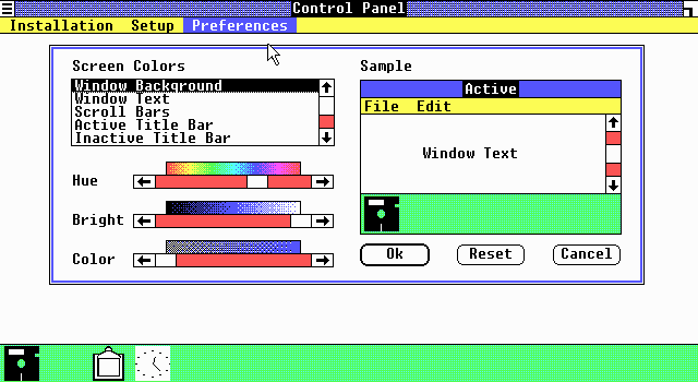
In the beginning, there was Windows 1.0, which looked very flat because screen resolutions were rather low in those days and color depth was practically nonexistent. If you had 16 colors, you were doing pretty good. You couldn’t afford to spend very many pixels on fluff like borders, and shadows were out of the question due to lack of color depth.

一开始,是 Windows 1.0,那时候用户界面看上去非常平坦,因为那时的屏幕分辨率很低,并且色彩深度差不多还是不存在的东西。如果能用到16种色彩,就已经做得很不错了。你没有办法在例如边框这种小细节上浪费太多像素点,而阴影这种东西由于没有色彩深度,是完全不可能的事。
(译注:下文中的 Windows 3.0 截屏链接已失效,上图来自 ToastyTech

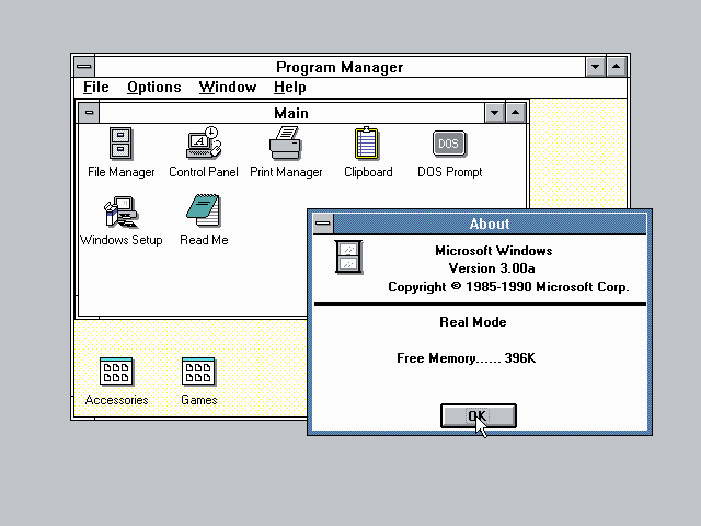
The “flat look” continued in Windows 2.0, but Windows 3.0 added a hint of 3D (notice the beveling in the minimize/maximize buttons and in the toolbar buttons on the help window).

这种『平面观感』延续到了 Windows 2.0 中,不过到了Windows 3.0 增加了一丁点的 3D 效果(注意观察最小化、最大化按钮以及在帮助窗口的工具栏按钮上出现的斜边)。

Other people decided that the 3D look was the hot new thing, and libraries sprung up to add 3D shadow and outlining effects to nearly everything. The library CTL3D.DLL started out as just an Excel thing, but it grew in popularity until it became the “standard” way to make your dialog boxes “even more 3D”.

其它人感到这种 3D 效果在当时是热门的新事物,为几乎所有东西增加3D阴影和边线效果的库突然开始涌现。CTL3D.DLL 一开始只是 Excel 的一个组件,但却逐渐普及开来,直到最终成为了使对话框变得『更加3D』的标准方式。
(译注:下文中的 Windows 95 截屏链接已失效,上图来自 ToastyTech

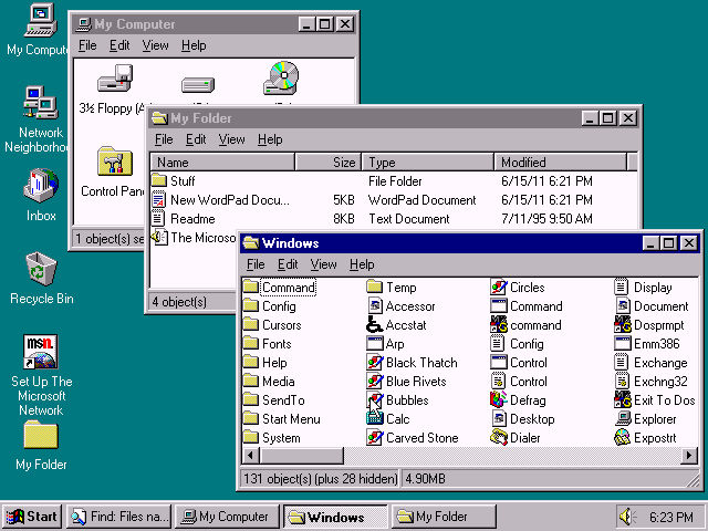
Come Windows 95, even more of the system had a 3D look. Notice the beveling along the inside edge of the panes in the Explorer window. Furthermore, 3D-ness was turned on by default for all programs that marked themselves as “4.0”; i.e., programs that were designed for Windows 95. For programs that wanted to run on older versions of Windows as well, a new dialog style DS_3DLOOK was added, so that they could indicate that they wanted 3D-ization if available.

到了 Windows 95 的年代,系统中有越来越多的组件拥有了 3D 外观,可以注意观察资源管理器窗口中面板内角的斜边效果。此外,3D 效果对于将自己标记为『4.0』的——亦即为 Windows 95 而设计——的应用程序是默认开启的。至于那些仍然希望可以在旧版本 Windows 上运行的应用程序,系统为其增加了一种新的对话框样式:DS_3DLOOK,以便程序向系统提出其在可用时对其应用3D效果。
(译注:若读者不是从 Windows 3.x 年代过来的人,可能理解不了下文中『睫毛膏涂坏』的效果,上图为调用了CTL3D32.DLL 的对话框样例,截图来自 malSmith.net

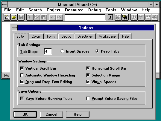
And if the 3D provided by Windows 95 by default wasn’t enough, you could use CTL3D32.DLL to make your controls even more 3D. By this point, things started getting really ugly. Buttons on dialog boxes had so many heavy black outlines that it started to look like a really bad mascara job.

如果 Windows 95 提供的 3D 效果还不够的话,你还可以调用 CTL3D32.DLL 来让你程序中的控件闲得更加 3D。至此,一切已经开始变得非常丑陋了。对话框中的按钮被添加了太多粗重的黑色边线,看上去就像把睫毛膏涂坏了一样。

Fortunately, like many fashions that get out of hand, people realized that too much 3D is not a good thing. User interfaces got flatter. Instead of using 3D effects and bold outlines to separate items, subtler dividers were used. Divider lines became more subdued and sometimes disappeared entirely.

幸运的是,就像那些失控的时尚潮流一样,人们开始意识到太多的 3D 效果并不是一件好事。用户界面(由此又)变得平面化起来。抛弃了运用 3D 效果和粗重的边线来划分窗体组件的做法,人们开始改用不易察觉的分隔线,而分隔线也变得越来越柔和,有时甚至完全消失了。
(译注:下文中的 Microsoft Money 截屏链接已失效,上图来自 Vector

(译注:下文中的 Office 2000截屏链接已失效,上图来自 Wikipedia

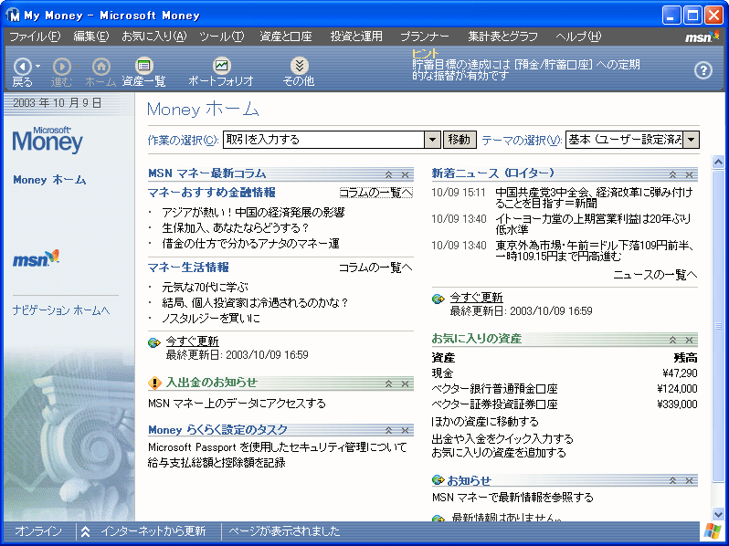
Microsoft Office and Microsoft Money were two programs that embraced the “less is more” approach. In this screenshot from Microsoft Money, observe that the beveling is gone. There are no 3D effects. Buttons are flat and unobtrusive. The task pane separates itself from the content pane by a simple gray line and a change in background shade. Even the toolbar has gone flat. Office 2000 also went largely flat, though some 3D effects linger, in the grooves and in the scrollbars (not visible in picture).

Microsoft Office 和 Microsoft Money 是两套拥抱『简单即为美』做法的应用程序。观察 Microsoft Money 的截屏,你会发现斜边效果不见了,3D 效果消失了,按钮变得平面化的同时也不再那么张扬了,任务面板通过划出一条简单的灰色直线、并改变其背景阴影的做法来将其与内容面板分隔开来,甚至工具栏都变『平』了。Office 2000 的界面也大范围变得平面化了,尽管在一些沟槽和滚动条上还是保留了一些 3D 效果(图中未展现)。
(译注:下文中的 Windows 95 截屏链接已失效,上图来自 ToastyTech

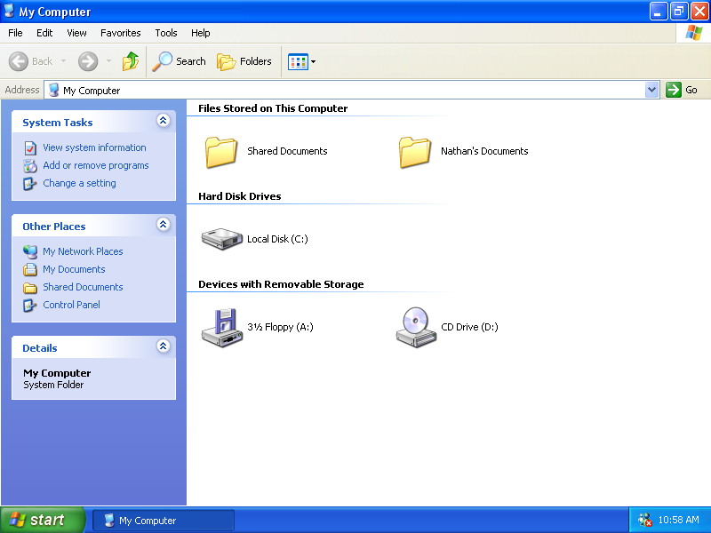
Windows XP jumped on the “flat is good” bandwagon and even got rid of the separator line between the tasks pane and the contents pane. The division is merely implied by the change in color. “Separation through juxtaposition.”

Windows 追随了『平面即是美』的风尚,甚至将任务面板和内容面板(译注:大概指的是资源管理器左侧的信息栏和右边驱动器内容)之间的分隔线都给去掉了,二者之间仅仅用颜色的变化稍作分隔,即所谓的『以反差做分隔』。
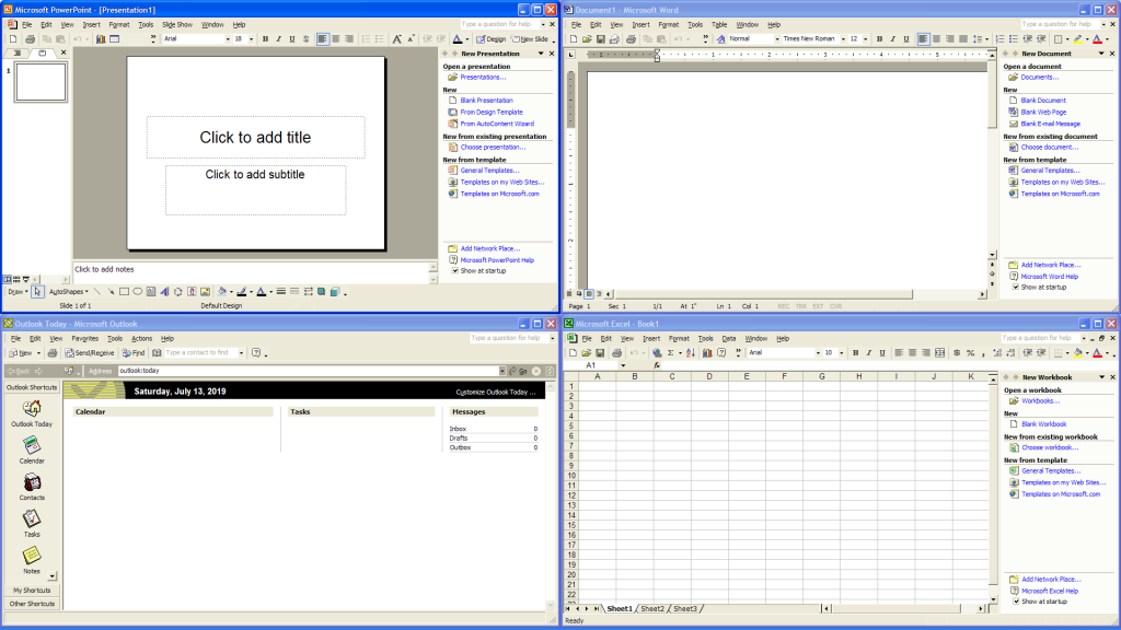
(译注:下文中的 Office XP 的截屏链接已失效,上图来自 Wikipedia

(译注:下文中的 Outlook 2003 的截屏链接已失效,上图来自 POP2IMAP.com

Office XP and Outlook 2003 continue the trend and flatten nearly everything aside from the scrollbar elements. Blocks of color are used to separate elements onscreen, sometimes with the help of simple outlines.

Office XP 和 Outlook 2003 延续了这一趋势,并将除了滚动条之外的几乎所有组件都扁平化了。色块被用来分隔屏幕上的元素,有时也会附加简单的边线。

So now the pendulum of fashion has swung away from 3D back towards flatness. Who knows how long this school of visual expression will hold the upper hand. Will 3D return with a vengeance when people tire of the starkness of the flat look?

现在时尚的钟摆又从 3D 荡回了平面,谁也不知道这一风潮能占上风多久。等到人们厌倦了平面观感的时候,3D 会不会杀个回马枪呢?

TONT 38343 二十英尺长的电脑

原文链接:https://devblogs.microsoft.com/oldnewthing/20040726-00/?p=38343

Back in the days of Windows 95, when Plug and Play was in its infancy, one of the things the Plug and Play team did was push the PCI specification to an absurd extreme.

回到 Windows 95 那时候,当即插即用(译注:链接已失效,指向页面为微软网站上介绍即插即用机制的页面,Web Archive 链接点击此处)年纪还小的时候,即插即用功能的研发组做了一件将 PCI 规范推向极致的事情。

They took a computer and put it at one end of a hallway. They then built a chain of PCI bridge cards that ran down the hallway, and at the end of the chain, plugged in a video card.

他们搬来一台电脑,将其置于走廊的一头,然后用一大溜 PCI 桥接卡从走廊的一头一直串联到另一头,最后在这个桥接卡链的末端插上了一张显卡。

And then they turned it on.

然后他们将电脑启动了起来。

Amazingly, it actually worked. The machine booted and used a video card twenty feet away. (I’m guessing at the distance. It was a long time ago.) It took two people to operate this computer, one to move the mouse and type, and another to watch the monitor at the other end and report where the pointer was and what was happening on the screen.

令人惊讶的是这事还真成了。机器启动了起来,并调用了20英尺(译注:约6米以上)外的那块显卡。(距离我是用猜的,这已经是很久以前的事情了。)操作这台电脑需要两个人,一个人(在一头)移动鼠标、敲打键盘,另一个人在另一头盯着显示器,汇报鼠标箭头在什么地方、以及屏幕上显示的内容。

And the latency was insane.

至于延迟,已经达到了难以言喻的地步。

But it did work and thereby validated the original design.

不过说到底是能正常工作的,也由此证实了设计是有效的。

Other Plug and Play trivia: The phrase “Plug and Play” had already been trademarked at the time, and Microsoft had to obtain the rights to the phrase from the original owners.

另一则关于即插即用的琐事:『即插即用』这个短语当时已经是商标了,所以微软不得不从其持有人那里获取使用权。

TONT 38363 为什么有些进程在被中止后,仍然在进程管理器中显示着?

原文链接:https://devblogs.microsoft.com/oldnewthing/20040723-00/?p=38363

When a process ends (either of natural causes or due to something harsher like TerminateProcess), the user-mode part of the process is thrown away. But the kernel-mode part can’t go away until all drivers are finished with the thread, too.

当一个进程被中止时(不论是通过比较自然的方式,还是比较严厉的如 TerminateProcess(译注:原文链接已失效,此处为MSDN上对应的文章目前可用的链接) 的方式),其用户模式下的部分就被抛弃了,不过其内核部分在线程中的所有驱动结束操作前,是无法被移除的。

For example, if a thread was in the middle of an I/O operation, the kernel signals to the driver responsible for the I/O that the operation should be cancelled. If the driver is well-behaved, it cleans up the bookkeeping for the incomplete I/O and releases the thread.

例如,如果某个线程正处在一个 I/O 操作中,内核将通知该 I/O 操作对应的驱动取消该操作。倘若这个驱动运作正常的话,就应当对这个未完成的 I/O 操作进行清理,并最终释放对应的线程。

If the driver is not as well-behaved (or if the hardware that the driver is managing is acting up), it may take a long time for it to clean up the incomplete I/O. During that time, the driver holds that thread (and therefore the process that the thread belongs to) hostage.

但如果驱动运作不正常(或其所管辖的硬件出现了问题),可能就需要比较长的时间来清理这个未完成的 I/O 操作。在此期间,该驱动将持续保有相应的线程(该线程所属的进程亦然)。

(This is a simplification of what actually goes on. Commenter Skywing gave a more precise explanation, for those who like more precise explanations.)

(这是对类似事情发生时的情况的一个简化描述,访客 Skywing 撰写了一份更加准确的描述(译注:链接已失效,我们永远都无法再知道那天dalao说了些什么了),喜欢细节描述的人可以去看看。)

If you think your problem is a wedged driver, you can drop into the kernel debugger, find the process that is stuck and look at its threads to see why they aren’t exiting. You can use the !irp debugger command to view any pending IRPs to see what device is not completing.

如果你认为问题出在某个加楔而入的驱动上,你可以打开内核调试器,找到那个(关不掉的)进程,检视其线程列表来判断为什么它不肯退出,也可以在调试器中使用 !irp 命令来观察处于等待状态下的 IRP(译注:I/O Request Package,I/O 请求包),并由此判断是哪个设备没有完成其操作。

After all the drivers have acknowledged the death of the process, the “meat” of the process finally goes away. All that remains is the “process object”, which lingers until all handles to the process and all the threads in the process have been closed. (You did remember to CloseHandle the handles returned in the PROCESS_INFORMATION structure that you passed to the CreateProcess function, didn’t you?)

当所有的驱动得知某进程被中止的情况后,该进程的『肉体』才终于消失,而剩下的只是一个『进程对象』继续等待着,直到所有面向该进程的句柄及进程的所有线程都关闭位置。(你应该有记得把在调用 CreateProcess 时在 PROCESS_INFORMATION 结构中返回的句柄们用 CloseHandle 都关掉来着(译注:原文链接已失效,此处为目前MSDN上的新链接),没错吧?)

In other words, if a process hangs around after you’ve terminated it, it’s really dead, but its remnants will remain in the system until all drivers have cleaned up their process bookkeeping, and all open handles to the process have been closed.

换句话说,如果某个进程在被中止后仍然挂在那里,实际上这个进程的确已经被中止了,只是还有点小『残余』留在了系统中,直到所有相关的驱动完成了针对这个进程的清理工作,以及所有由该进程打开的句柄被关闭为止。

TONT 38373 为什么你不能捕获TerminateProcess?

原文链接:https://devblogs.microsoft.com/oldnewthing/20040722-00/?p=38373

If a user fires up Task Manager and clicks “End Task” on your program, Windows first tries to shut down your program nicely, by sending WM_CLOSE messages to GUI programs and CTRL_CLOSE_EVENT events to console programs. But you don’t get a chance to intercept TerminateProcess. Why not?

如果用户打开任务管理器,选中你的程序之后点击『结束任务』,Windows将首先尝试优雅地通知你的程序进行关闭,方法是向GUI应用发送WM_CLOSE消息,或者向控制台应用发送CTRL_CLOSE_EVENT事件。不过,你是不可能拦截 TerminateProcess 的。这是为什么呢?

TerminateProcess is the low-level process killing function. It bypasses DLL_PROCESS_DETACH and anything else in the process. Once you kill with TerminateProcess, no more user-mode code will run in that process. It’s gone. Do not pass go. Do not collect $200.

TerminateProcess(译注:原文链接已失效,此处为MSDN上对应的新链接)是一种底层结束任务的方法,可以绕过 DLL_PROCESS_DETACH 及进程中的任何东西。一旦调用 TerminateProcess 来结束进程的话,该进程中将不再有任何用户模式的代码可以运行。就那么结束了。别再想着过起点了,也别再想挣200块的事了。(译注:Do not pass go. Do not collect $200是原版“大富翁”游戏中直接将其它玩家送入监狱格的事件卡片背面文字,用于强调“啥也别想了,没救了”的意思。)

If you could intercept TerminateProcess, then you would be escalating the arms race between programs and users. Suppose you could intercept it. Well, then if you wanted to make your program unkillable, you would just hang in your TerminateProcess handler!

假设有办法拦截 TerminateProcess 的话,不过是恶化了程序和用户之间的军备竞赛而已。设想如果可以拦截它,那么,如果想让你的程序无法被中止,只要在你的 TerminateProcess 处理进程中挂起就好啦!

And then people would ask for “a way to kill a process that is refusing to be killed with TerminateProcess,” and we’d be back to where we started.

然后就会有人提出『如何中止拒绝被 TerminateProcess 杀掉的进程』这样的问题,于是我们又回到了问题的开头。

TONT 38383 为什么Windows 98下的最大显示器数量是9?

原文链接:https://devblogs.microsoft.com/oldnewthing/20040721-00/?p=38383

Windows 98 was the first version of Windows to support multiple monitors. And the limit was nine.

Windows 98是支持多显示器的第一个Windows版本,而显示器数量的上限是9。

Why nine?

为什么是9呢?

Because that allowed you to arrange your monitors like this. You have early seventies television to thank.

因为这个数字允许你将显示器的排列摆成这样(译注:即3×3的显示器阵列,类似老式高档电视中的多频道预览功能)。这一点你得感谢70年代早期的电视设计。

TONT 38463 留心那些示例URL们

原文链接:https://devblogs.microsoft.com/oldnewthing/20040713-00/?p=38463

When writing documentation, one often has need to come up with a sample URL to illustrate some point or other. When you do, make sure the sample URL is under your control.

撰写文档时,有时需要一个示例 URL 来描述一些论点之类的东西,遇到这种情况时,留心让那些示例 URL 在你的掌控之下。

I remember a Windows beta that used the sample URL http://www.xxxxx.com/ in a dialog box. You can imagine where that actually goes.

我记得有一个 Beta 版的 Windows 在某个对话框中使用了 http://www.xxxxx.com/ 作为示例URL,可想而知这个网址指向的是什么地方。

This web site uses www.wallyworld.com as a sample URL. Perhaps they didn’t realize that it’s a gay porn site.

这个网站(译注:链接已失效)使用了 www.wallyworld.com 作为示例 URL,估计他们没想到这个网址是一个同性恋色情网站。

(Raymond’s strange dream story: One night I dreamt that I found a web site that had a complete Dilbert archive, and for some reason the name of the site was “Wally World”. In the morning, I checked out the site and was in for a big surprise…)

(Raymond 的怪梦小故事:某晚我做了一个梦,梦见有个网站上有 Dilbert 漫画的全集存档,并且不知为何网站的名字叫 Wally World。第二天早上,我搜了一下这个网站,结果非常令人“惊喜”。)

So play it safe. When you need a sample URL, don’t just make something up. If you do, odds are good that somebody is going to rush in and register it. Make your sample URLs point back to your company’s home page, or use http://www.example.com, which the IANA has reserved for use in sample URLs. If that’s too dorky, you can always go out and register the domain you want to use as your sample, so that nobody else can sneak in and steal it. (This does have the problem of incurring renewal fees.)

所以还是小心为妙。当需要用到示例 URL 时,不要随手编一个就算了,总有人会立马跑去把这个域名注册下来。你可以让这个示例 URL 跳转回贵公司的主页,或者直接用 http://www.example.com ,这是 IANA 为示例 URL 保留的一个域名。如果你觉得这样太傻了,你当然也可以选择(先)特意注册一个域名,然后将它用在你的示例 URL 之中,这样就不会有人悄悄地将其据为己有了。(不过这样也会有为其续费的问题存在。)

TONT 38493 『添加/删除程序』是如何获知应用程序的大小等信息的?

原文链接:https://devblogs.microsoft.com/oldnewthing/20040709-00/?p=38493

If the program doesn’t provide this information itself, Add/Remove Programs is forced to guess.

如果应用程序没有主动提供这些信息,『添加/删除程序』不得已就得用猜的了。

The problem is that there is no “obvious” way to map an entry in the Add/Remove Programs list to an actual program. Each entry in the list, for those who care about such things, comes from the HKEY_LOCAL_MACHINE\Software\Microsoft\Windows\CurrentVersion\Uninstall registry key. The only mandatory properties for an uninstallable program are the DisplayName and the UninstallPath. Everything else is optional.

问题在于,『添加/删除程序』并没有一种明确的手段将一项(已安装程序的)条目与实际的应用程序关联起来。为关注相关事项的人服务一把:(『添加/删除程序』中的)每一个条目都取自注册表键 HKEY_LOCAL_MACHINE\Software\Microsoft\Windows\CurrentVersion\Uninstall。对于每个可以卸载的应用程序而言,必需的条目是 DisplayName 和 UninstallPath,剩下的都是可选项。

Let’s suppose Add/Remove Programs is given a program registration like this:

假设有以下注册表信息被给予了『添加/删除程序』:

HKEY_LOCAL_MACHINE\
Software\
Microsoft\
Windows\
CurrentVersion\
Uninstall\
SomeProgram
DisplayName=REG_SZ:”Awesome Program for Windows”
UninstallPath=REG_SZ:”C:\WINDOWS\uninstall.exe -SomeParameters”

In order to get the “Last Used” and “Frequency” values, Add/Remove Programs needs to know the name of the EXE so it can ask the Start menu “Hey, how often did the user run this program, and when was the last time it happened?”

为了获取『最近使用时间』和『使用频率』的值,『添加/删除程序』需要知道应用程序主程序的EXE文件名,这样才能向开始菜单咨询:『嗨,用户有多经常运行这个应用程序,上次运行又是什么时候的事情呀?』

Notice that there are no clues in the registration above as to the identity of this EXE file.

请注意,上述注册表信息中,并无辨认应用程序主程序EXE文件的线索。

So Add/Remove Programs starts guessing. It goes through all the programs on your Start menu and compares their names with the display name of the uninstallable item. It looks for Start menu items which share at least two words with the words in the DisplayName.

于是『添加/删除程序』就开始靠猜的了。『添加/删除程序』遍历开始菜单,将上述注册表信息提供的、可卸载应用程序的『显示名称』与开始菜单中的条目进行比较,标准是有至少两个单词与 DisplayName 相同。

For example, if there were a Start menu item called “Pretty Decent Windows Program”, this would count as a two-word match (“Windows” and “Program”).

例如,如果有一个开始菜单条目叫『Pretty Decent Windows Program』,这样就算有两个单词相符(Windows 和 Program)(译注:前例中的 DisplayName 叫 Awesome Program for Windows)了。

It then takes the one with the most matches and decides, “Okay, I guess this is it.” Suppose for the sake of illustration that the best match is indeed “Pretty Decent Windows Program.lnk”, which is a shortcut to “C:\Program Files\LitWare\Decent Program\Decent.exe”. Add/Remove Programs would decide that “Awesome Program for Windows” should get the icon for “Pretty Decent Windows Program.lnk”, that the frequency of use and most-recently-used information for “C:\Program Files\LitWare\Decent Program\Decent.exe” will be displayed for “Awesome Program for Windows”.

『添加/删除程序』会挑选相似程度最高的一项,然后下定决心说:『行了,依我看就是它了。』假设在本例中,相似程度最高的一项正好是『Pretty Decent Windows Program.lnk』,而它是到『C:\Program Files\LitWare\Decent Program\Decent.exe』的快捷方式,『添加/删除程序』便由此决定『Awesome Program for Windows』应当采用『Pretty Decent Windows Program.lnk』的图标,而使用频率和最近使用时间的信息则取自『C:\Program Files\LitWare\Decent Program\Decent.exe』。

But wait, there’s more. There’s also the program size. Add/Remove Programs looks in your “Program Files” directory for directories whose names share at least two words in common with the DisplayName. The best match is assumed to be the directory that the program files are installed into. The sizes are added together and reported as the size of “Awesome Program for Windows”.

不过等等,还没完。还有一项信息叫『大小』。『添加/删除程序』将在『Program Files』目录中查找与 DisplayName 有至少两个单词相同的项目,而该项目则被视为应用程序的安装目录。将这个目录下的文件大小汇总一下,这个数字就作为『Awesome Program for Windows』的『大小』了。

A program can add some properties to its registration to avoid a lot of this guessing. It can set an EstimatedSize property to avoid making Add/Remove Programs guess how big the program is. It can also set a DisplayIcon property to specify which icon to show for the program in the list.

应用程序可以在向注册表中写入信息时主动指定对应的属性值来避免上述的猜测工作,比如可以通过设置 EstimatedSize 属性来省去『添加/删除程序』估算应用程序的大小,也可以通过设置 DisplayIcon 来指定在列表中应用程序的图标。

But if a program omits all of these hints, the guess that Add/Remove Programs ends up making can often be ridiculously wide of the mark due to coincidental word matches. In my experience, Spanish suffers particularly badly from this algorithm, due to that language’s heavy use of prepositions and articles (which result in a lot of false matches).

不过,如果某个应用程序完全无视这些提示的话,『添加/删除程序』估测出来的信息有可能因为巧合的单词相符而与实际情况大相径庭。据我个人经验而言,西班牙语(的条目)在面对这一算法时误差最大,原因是西班牙语中的介词和冠词的使用极其频繁(因而造成了大量的误匹配)。

Yes, this is all lame, but when you are forced to operate with inadequate information, lame is the best you can do.

没错,这个机制是很蹩脚,但当你被迫用不完整的信息来构建资料时,做到蹩脚已是最好的结果。

[July 15 2004: Emphasizing that this is done only if the program fails to provide the information itself. For some reason, a lot of people who link to this page fail to notice that little detail.]

(2004年7月15日更新:强调一下,『添加/删除程序』只有在应用程序未能提供相关信息时才会进行上述的猜测工作。不知为何,很多链接到这个页面的读者都忽略了这一细节。)

TONT 38513 关闭阴影效果时,为什么图标下的文字会有一个纯色色块?

原文链接:https://devblogs.microsoft.com/oldnewthing/20040708-00/?p=38513

A commenter asks why icon label have “those ugly color boxes” when there is a background image.

有位访客在评论中提问为什么当设置了背景图片时,图标标签下面会有『难看的色块』。

The answer: Because the alternative would be worse.

答:因为不这样的话更难看。

Imagine if there were no solid background between the text and the background image. You would end up with text against an unpredictable background, which doesn’t help readability.

试想,如果在文本和背景图片之间没有纯色背景衬托的话,结果就变成文本压在了无法预测的背景图片上的情况,对可读性并无益处。

Take the default background for Windows XP: There are some places that are very light and other places that are very dark. No matter what color you pick for the icon text, it will look bad in one or the other place. If you decide to use white, then the text becomes unreadable in the clouds. If you decide to use black, then the text becomes unreadable in the shadows.

以 Windows XP 的默认背景(译注:Bliss,即经典的蓝天白云绿草地)为例:图片上的某些部分特别亮,有些则特别暗。不论你选择哪种(单一)颜色作为图标标签文字的颜色,都可能在一处或者另一处看上去很难看。用白色,那么在白云部分文字就很难看清,而用黑色的话,在阴影部分又看不见了。

You lose either way.

怎么样都是输。

The solution is to intercede a contrasting color to ensure that the text is readable. If your video card is powerful enough, the contrasting color is used only just around the strokes of text themselves, which lends a shadow-effect. If shadows are not enabled, then a solid block of contrast is used.

解决方案是引入高对比度的颜色从中斡旋,以确保文本的高可读性。如果你的显卡性能足够强,这个高对比度的颜色只会在文字的边缘轻轻一描,形成一种阴影效果。而如果阴影效果没有启用的话,那么就会在文字下方描绘一个纯色色块。

(And for those of you who say, “Use white in the dark places and black in the light places,” what if there is a section of the wallpaper that has a dark area right next to a light area, and the text covers both?)

(至于那些准备说『在深色区域用白色,在浅色区域用深色』的那些人,如果(用户的)壁纸上正好有一块深浅相间的区域,而图标标签的文本正好横亘其上呢?)